
How do I compare historical price trends across
cities?
Want to know which city actually outperformed the rest over a decade? Here’s how to compare historical price trends across cities and make decisions that win.
Quick promise
You’ll learn a repeatable, data-first method to compare historical price trends across cities. No fluff. Clear steps, metrics to use, and what to act on next.
Step 1 — Pick the right baseline and timeframe
Choose the same property type (detached, condo) and the same metric (median price, average price, or price per sqft). Use a consistent timeframe — 3, 5, and 10 years are standard. Longer timeframes reduce short-term noise.
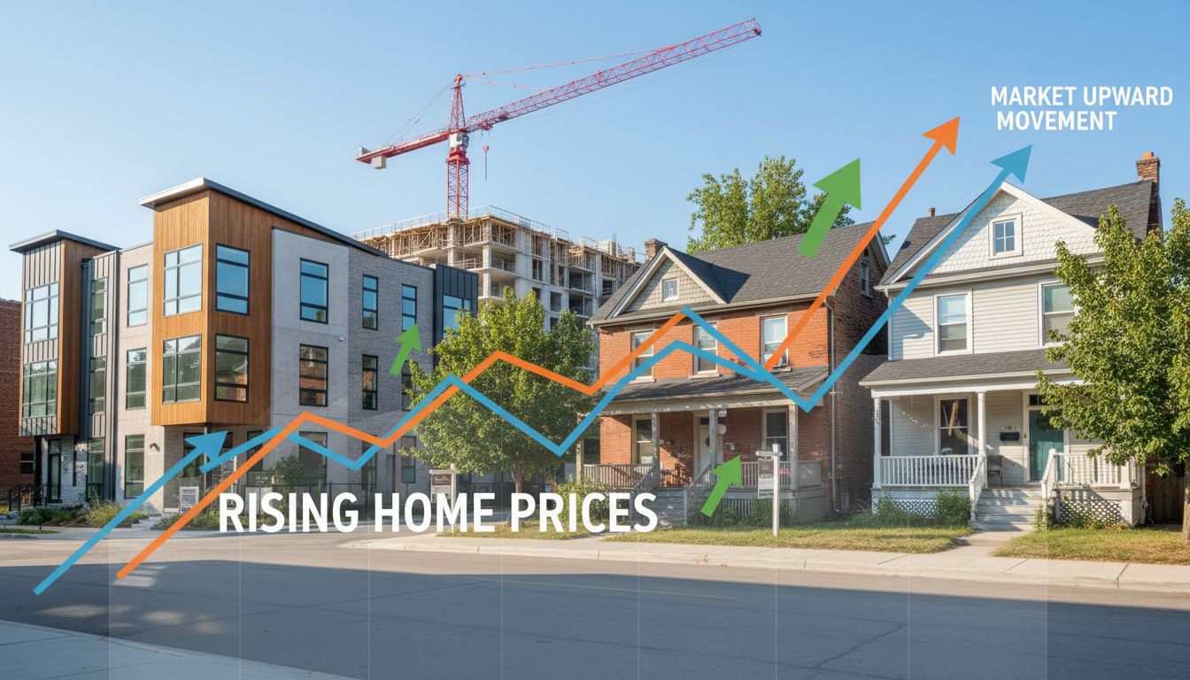
Keywords: historical price trends, median house price, price per sqft
Step 2 — Normalize the numbers
Compare percent change and CAGR (compound annual growth rate). Percent change hides time effects. CAGR gives apples-to-apples annual growth.
Formula (simple): CAGR = (EndPrice / StartPrice)^(1/years) – 1
Example: City A $600k → $900k in 5 years: CAGR = (900/600)^(1/5)-1 = 9.86%.
Also adjust for inflation (use CPI) to get real returns. Use constant dollars to compare purchasing power across time.
Step 3 — Use the right data sources
Get MLS stats, CREA reports, municipal datasets, Statistics Canada, Bank of Canada CPI, and reputable local portals. Verify median vs mean. Exclude ultra-luxury outliers when comparing mass market.
Keywords: MLS data, StatsCan, CREA, adjusted for inflation
Step 4 — Compare volatility and liquidity
Growth alone hides risk. Track:
- Standard deviation of monthly/quarterly prices (volatility)
- Inventory and months of supply (liquidity)
- Days on market (demand heat)
A city with higher CAGR but extreme volatility and low inventory can be risky for quick trades.
Step 5 — Layer in fundamentals
Match price trends to supply-demand drivers: population growth, new construction permits, job growth, interest rate cycles, and policy changes. If prices rose 40% because inventory cratered, that’s different from steady growth backed by jobs.
Keywords: supply demand, inventory, job growth, housing starts
Step 6 — Visualize and score
Create side-by-side charts: indexed price series (start = 100) for each city, CAGR bars, volatility bars, and affordability scores. Use color to highlight winners and laggards.
Scoring example: CAGR (50%), Volatility (20%), Inventory trend (15%), Affordability shift (15%).

Expert tips that move money
- Compare the same property segment only.
- Use rolling 12-month medians to smooth seasonality.
- Watch policy cliffs (tax changes, zoning shifts) — they flip trends fast.
- For buyers: target cities with stable CAGR + improving inventory.
- For sellers: list when your city’s inventory drops and demand spikes.
Next steps (do this today)
Pull 5-year and 10-year median prices for your target cities. Compute percent change, CAGR, and inflation-adjusted return. Rank by a simple score (CAGR minus volatility).
Want faster answers with local context? Contact Tony Sousa — Toronto-area market expert. Email: tony@sousasells.ca | Phone: 416-477-2620 | https://www.sousasells.ca
Clear method. Real metrics. Actionable signals. Compare historical price trends across cities like a pro and make decisions that win.